Sunday, 15 December 2013

Liminal Spaces - Video

After a meeting with Jill, she quickly saw a link between mine and an ex student Lia Hayes's work after looking at my nature photography. After taking a look at Hayes' work, our work seems to have a certain emptiness about it as we explores areas that would otherwise be overlooked and attempt to put a narration to them. In Hayes' work this is sometimes a spoken/written narration, or music she put over the top of a video. 
When I first started thinking about how I was going to capture nature's liminal spaces, I did think about doing a video with the sounds of the natural enviroment of the space but never did it. However, after looking at Hayes' work I decided to give it a go with my buildings liminal space exploration. 


With this video, I wanted to really pick apart the barns characteristics and find what it was that made it such an odd space. By isolating the sounds of the barn and playing them over the still images, it created a frozen in time effect; but when I played the song over the videos at the end, it seemed to bring the space to life and it was no longer a dead space. This is similar to what I was trying to achieve by putting images of life behind the tree/cave photos.
I really like the finished piece of this but I'm not sure how I would or will present it. I would quite like to project it onto a liminal space like previously mentioned Polly Stanton.

Liminal Spaces - Building Photography

I wanted to also look into liminal spaces in decrepit buildings so I went about it in a similar way to the spaces in nature.


I love this shot - I think it is to do with all the sharp, linear angles and then the wobbly red hand rail.


This shot is also interesting, the coat hanging on a pillar adds an almost eerie feel to the image and also prevents it from being too cluttered with all the items in the background. 


There are so many spaces to play with that I'm almost a little swamped with these images. I think I'll go about cutting them up with a craft knife as I did with the tree/cave images to highlight the spaces that really catch my eye. I also want to collage these but I also think it would be interesting to combine these very industrial man made liminal spaces with the liminal spaces I found in nature. 
I also want to start illustrating these with drawn characters although I'm not too sure how to do this just yet. 


Liminal Spaces - Sharon Kelly working through ideas


I've posted this artist to show how she works through her ideas in quick sketches. This is how I liked working at the beginning of the project and think it would be beneficial to do it again just to get my ideas down on a page. You can see her figuring out what it is she finds interesting in the process of the runner and she flicks through different scenes, focusing on different aspects. 

Liminal Spaces - Pat Perry observational sketchbook

I couldn't quite believe it when I came across this artist. His images is almost the exact idea I had in mind for my own work , he perfectly combines figures with liminal spaces!
From his sketchbook you can see he gets all of his inspiration from observational drawing, this is something I really need to do more of. I did this at the beginning and could feel myself getting ideas and inspiration immediately yet I haven't continued to do this in the project.


Liminal Spaces - Animating Images


I wanted to work further into my images, introducing characters like I had previously done or animating an otherwise empty liminal space. I wanted to stick with the garish/vintage feel I had achieved with the editing.


I began to highlight the spaces that I found interesting in pen and then went on to cut them out with a craft knife. I didn't know what to do with these blank spaces so I began to experiment with different backgrounds.


I like the combination of the nature and snapshots of life through spaces. I particularly like the juxtaposition of the sexual fashion images through the branches.

Liminal Spaces - Editing Images


This was a happy accident, after printing I realised it looked over edited and at first dismissed it. However, after looking at all my other images this one really stood out to me. I think this is due to the over editing producing almost a retro, old feel - it certainly brought something new to the image.
I think the juxtaposition of the garish pink sky with a modest simple image of nature is what really interested me - it brings life to an otherwise empty liminal space. On retrospect, this fits in with what I was trying to do by incorporating silhouettes into a liminal space.

Liminal Spaces - Photography

Polly Stanton

I liked this artists work as she combines 2 kinds of liminal spaces (kind of like my working in a book), the one in the image and the place where the image is displayed.
This image particularly appealed to me as she finds the liminal space in nature, something I hadn't yet thought about. This inspired me to go out and take pictures of liminal spaces I could find in nature as well.


My Photography


After analyzing these images, I found I was once again focusing on the spaces and shapes between things e.g. the spaces between the branches and the sky.

Liminal Spaces - New kind of Sketchbook


Taking inspiration from the artists I had previously looked at, I began to work in my own book from the observational drawings I had previously done. This time I began to focus more on the characters going into the spaces to make them more narrative.


I like the block colour red - this really lifts the image from the page.


As my work went along I found I was focusing on how I could bring life to a liminal space whether it be through colour or characters.


Liminal Spaces - Artist Inspiration


Me, With My Head in the Clouds


I came across this artist when searching for artists that work on liminal spaces. At first it was just a spread on liminal spaces she had done in a written book - this caught my eye mainly because of the working in an old book. However, after more thought I realized that the pages of a book ARE a liminal space - there is a whole other world in those words yet we only pass by; we can't physically step through or remain in that world. I thought this would be a good place for me to explore my work into liminal spaces further.

Romany WG


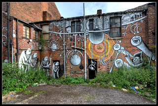
This artist caught my eye as he focuses on capturing images that incorporate caricatures into liminal spaces, or in his case - derelict buildings. I love this combination and would also like to look into derelict buildings as a liminal space as I have always been drawn to abandoned spaces and would like to explore what it is about them that interests me.  On the other hand, his work also seemed quite similar with what I was trying to do by drawings figures passing through the space - as if trying to inject a bit of life into a liminal space.


Liminal Space - Observational Drawing / Drawing Week


Observational Drawing


I chose this space as a starting point - as soon as liminal space was mentioned this area came to mind. As I started to draw it I began to realize there were several things I found fascinating about it. I noticed the large amount of different angles all stuck together, such as the arch of the "snack station" with the sharp diagonal outline of the staircase above it. I began to focus on these shapes.


Also the emptiness of the entire hallway seem to juxtapose with the modern, ultra high tech layout of the room. All the bright lights and signs seem give the feel of a gathering area, yet people just passed through - barely talking.


I began to focus on the silhouettes of people simply moving through the space, mainly with heads down and no socializing. 

Text & Image - Working as a Group, Deadlines, Publication

I have found this project to be one of the hardest and stressful projects I have done. This is due to a combination of things, mainly because it was my first time working in a group. I found myself stressed all the time to meet deadlines otherwise I would let other members of the group down. I also found myself worrying whether other members of the group were going to meet the deadline (which some of them didn't) and therefore the rest of us would be stuck or have to pick up their weight, or our production would suffer and there's nothing I could do about it. I think the fact that the success of the publication wasn't completely in my control was something very new to me and I had to get used to it. 
I also really wanted the whole production to be a group project, so if there were group decisions I didn't like or would have preferred to do something else it was hard to swallow this and go with the group. 
I think because it was the first time this was hard, but I would like to do another group collaboration, maybe not with so many people next time as it would be easier and more enjoyable. 
I think it would have been helpful for the group to meet and work together more often so that everybody was on the same page about exactly what was expected of them. There was some confusion as to how the book was going to be put together as we were meant to get the layout of the book on InDesign in A5 with an inch binding space. So when it came to binding everything (last minute as deadlines kept being avoided and missed) it was made even more difficult and time consuming as things weren't the right size or put onto the computer when they could have just been printed rather than stuck in individually. 
We didn't even agree on a front cover or plan one because the group was never able to meet as a whole, so that ended up being rushed. 
Whilst this all sounds terrible, it wasn't really all that bad. It was just a rush at the end and things weren't as perfect as I would have liked them to be. I did actually enjoy exchanging ideas and seeing how other people worked, setting deadlines made sure I got things done. This is why I would like to try again, maybe with a less imminent exhibition at the end of the project and less people to try and gather together. 

Text & Image - Piece of Writing

As I wanted to have a scientific piece in the book, I decided to use my research on the meanings of dreams. However, as I want most of my images to be interactive I had to think about how I could do this with my text. As I hadn't yet used the part of JK Rowling's mum and dad popping up I knew I had to put it in with the text somehow. I want the book to be random and unpredictable - just like dreams, so this would work really well.
I decided just to have them just pop straight up out of the text, interupting it much like they did in the dream itself.
As their appearance in the dream wasn't clear yet I somehow knew who they were, this drawing seemed appropriate to express them.

Text & Image - Recreating Images

As we had to spend the last week simply reproducing our images 10 times I had to start thinking about how I was going to do this with my images. I started with my forest piece as I felt this would be the hardest to reproduce.
I needed to think about how I was going to create the slides for 10 different books. I began with the background.


I will layer each of these different sized images over each other and stick them together at the top and bottom to create the platforms for the family caractures to slide in and out of.


These caractures would then be slid into each layer, the mum character on the largest first panel and so on.
 
After planning all of this and getting the images saved in the right size and so on, it turned out this would be one of the easiest to recreate - I could just print out 10 copies of everything and assemble it very quickly.
The folding of the "clean me" is going to be the worst as I have to paint 10 pieces of newspaper white and then do the whole folding process 10 times and then write "clean me" manually 10 times.


Text & Image - Paper Folding

I recently had a paper folding workshop where I was taught this technique. Although I found it very difficult to get the hang of, I enjoyed the challenge and found myself completely absorbed in trying to achieve this pattern. I've never thought about paper folding as an art form before and I've never looked into it, however, after the workshop I found myself wanting to do more with the design and I started to think about how I could incorporate it into my production. 
After the folding, the paper is very interactive as if you bend it in a certain way it creates different shapes so it would work with my dream diary which I want to be interactive. I realised that if I wrote letters on one side of the fold it was almost like a secret message - you had to look at the paper from a certain angle to read it. The "Clean Me" dream is by far my most boring dream and my sketchbook design for it was very simple and dull and I thought this technique would be perfect for making the dream more interesting. 


I experimented with different papers but found the thicker the paper, the harder it was to achieve the effect.
After some experimentation, I settled with folding newspaper as this was the thinnest paper and also the text behind the phrase "clean me" exaggerated the phrase as the paper itself looked messy. 
I also experimented a little more with the folding and found that by repeating the same technique on the same piece of paper 3 times it created a brilliant shape where it was even harder to decode the message.